
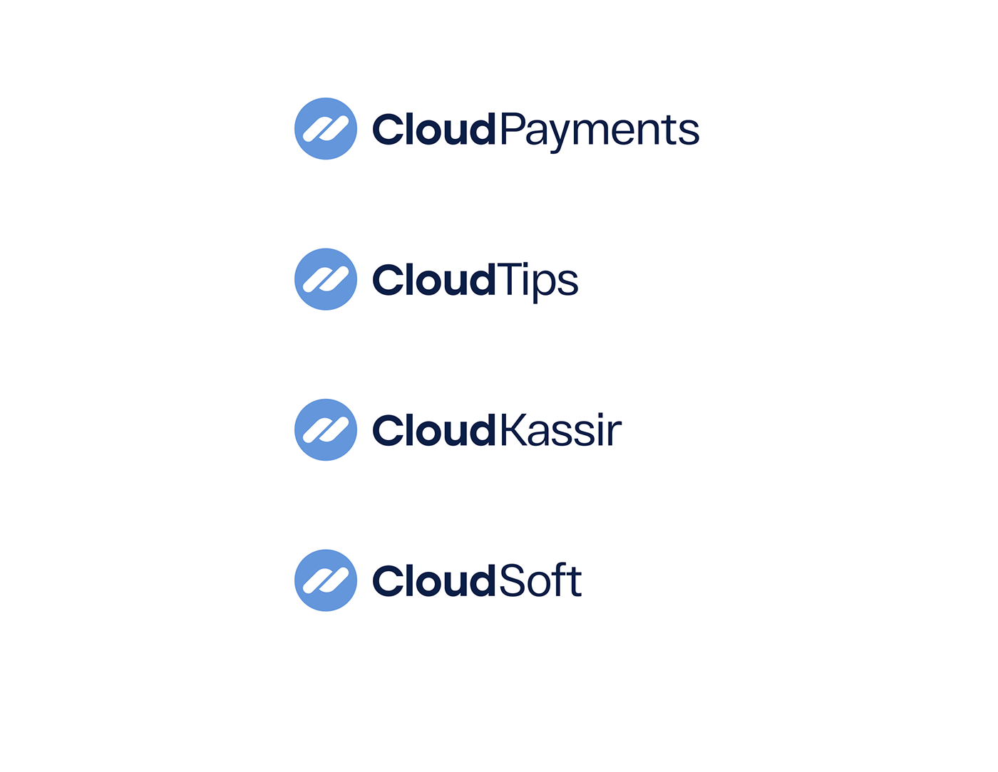
CloudPayments is a corporate group that includes multiple subsidiaries and online services: an internet acquiring service, an online cash register software CloudKassir, a cashless tipping service CloudTips, and a cloud-based payment management software CloudSoft.
CloudPayments was looking for a unique brand identity; they wanted to update their visuals to communicate better the company's core values: credibility, security, agility, transparency, and state-of-the-art technologies.
When they contacted us, CloudPayments had already had around 200 versions of the logo but couldn't decide on one.
When they contacted us, CloudPayments had already had around 200 versions of the logo but couldn't decide on one.
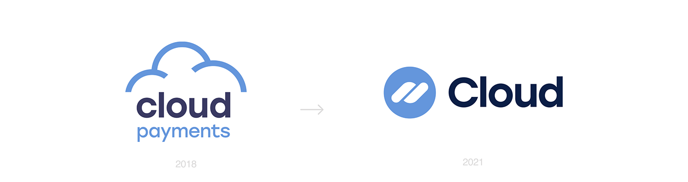
The former logo with a cloud symbol was designed in 2014 and stayed the same with slight changes in 2018. If a cloud symbol was a typical symbol for cloud technologies eight years ago, today, it looks outdated.
Plan
1. Design a consistent yet flexible logo system that would fit the future scaling of the company.
2. Update the existing logo and design a system to spread the visual identity across all communication channels.
Brainstorm
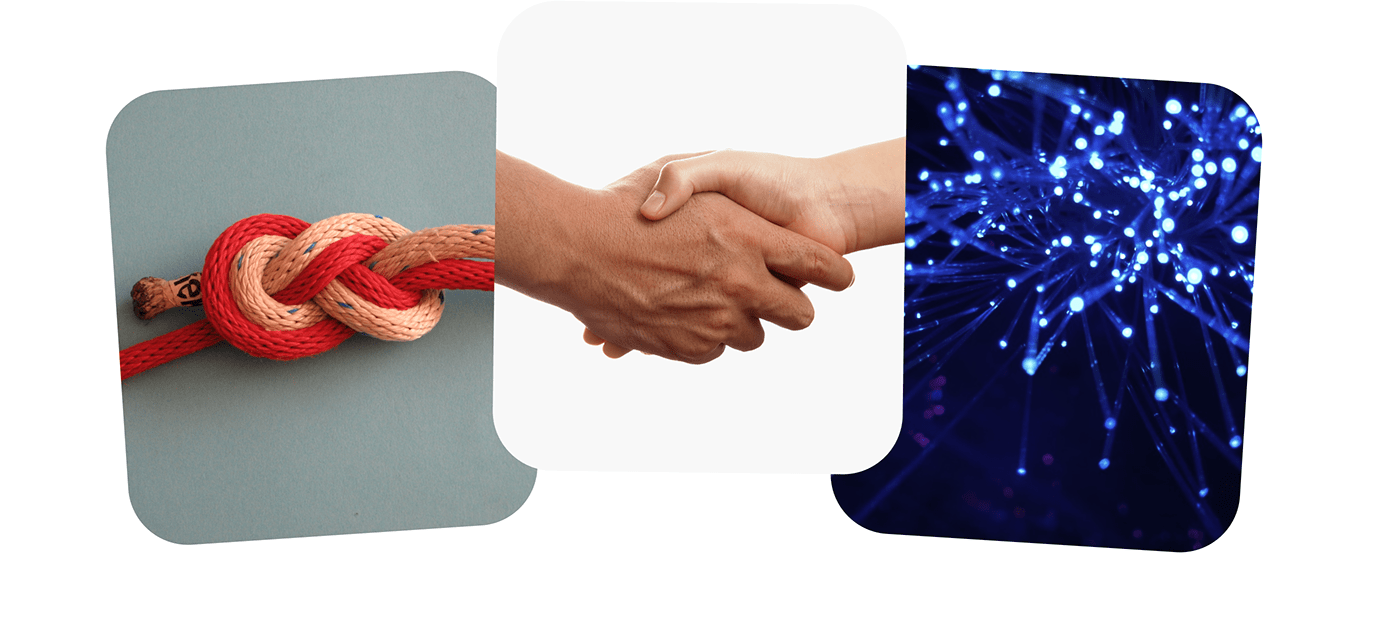
We started by looking for images, concepts, and values that would define the framework for the new identity. After sifting through many options, we settled on cooperation, a handshake, and synergy.
Cooperation is the key to a successful business, transformation, and agility. A handshake stands for a mutually beneficial partnership; synergy means communication and greater power through combined efforts. After that, all we had to do was to find a form that would express these messages.
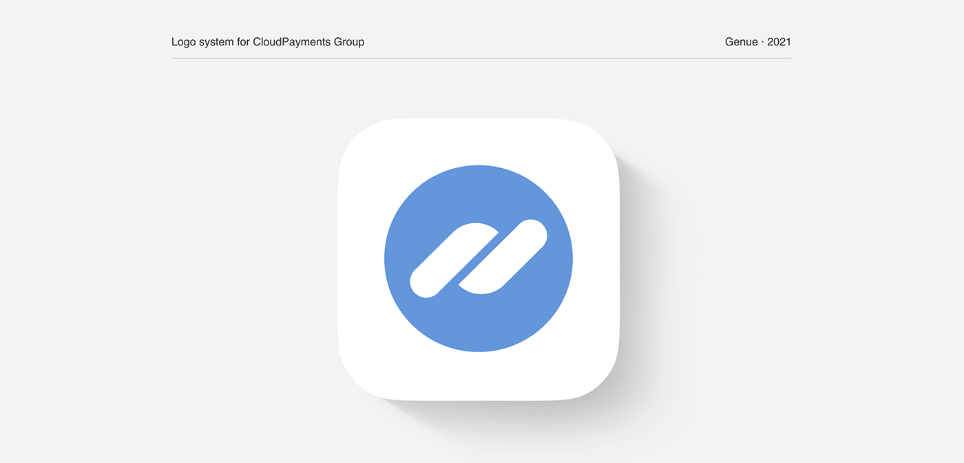
New Logo
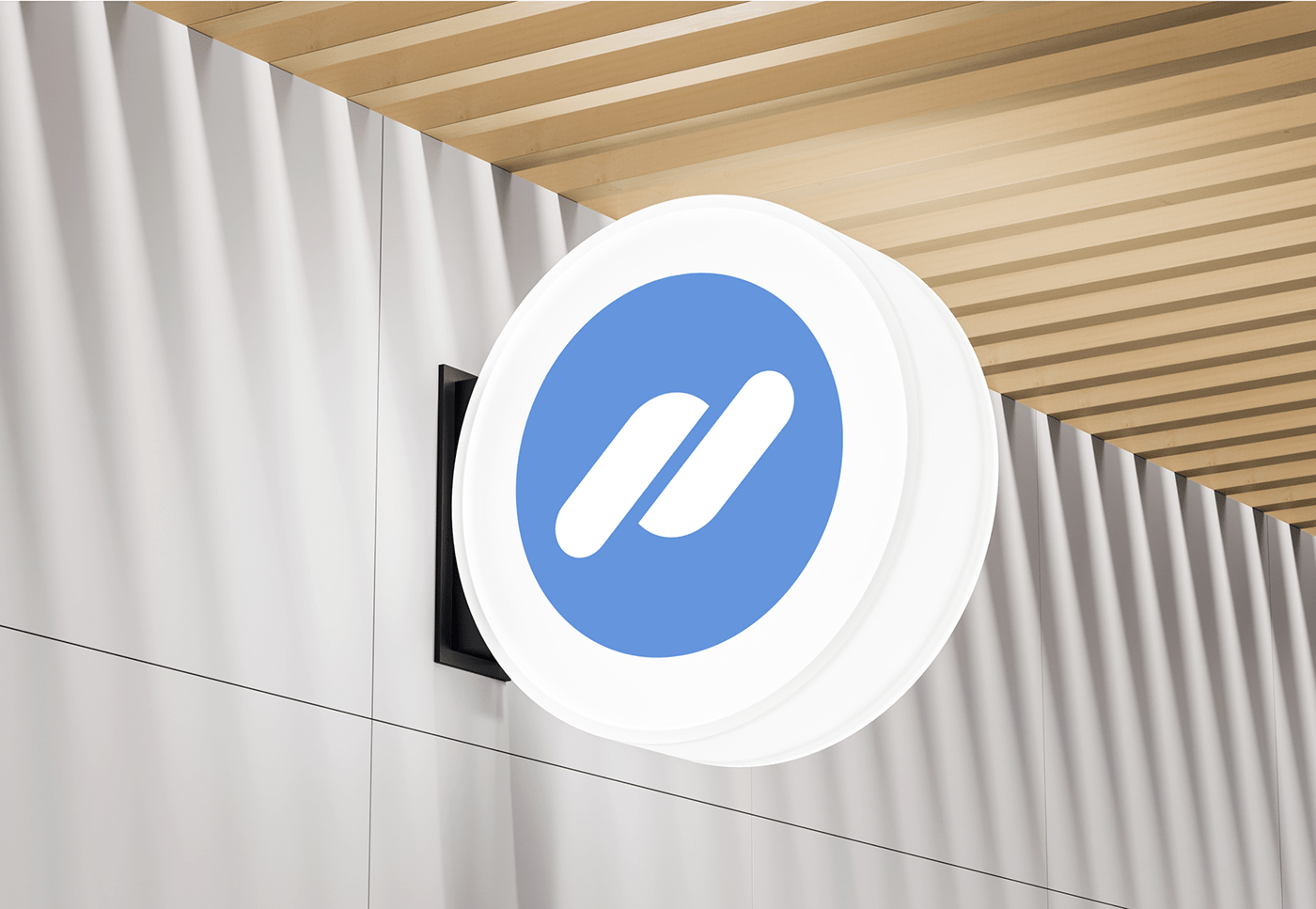
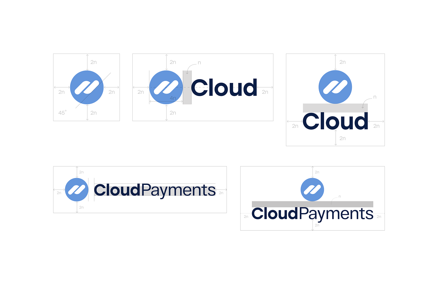
The new logo has identical elements facing each other at a 45-degree angle. Sense of movement makes it feel more impactful and dynamic. It is trendy and conveys exactly what we wanted to say with it.
Rounded corners hint at the brand's history and where it all began – a cloud. Two versions of the logo serve as a base for the CloudPayments brand identity. Both of the marks are elegant and meaning-heavy.
Typography
The Stolz typeface remained at the core of the typography design. Its geometric simplicity works perfectly with the new rounded logo.
We made the symbols more graphic, lowered the ascender of the letters, L and D, and adjusted kerning.
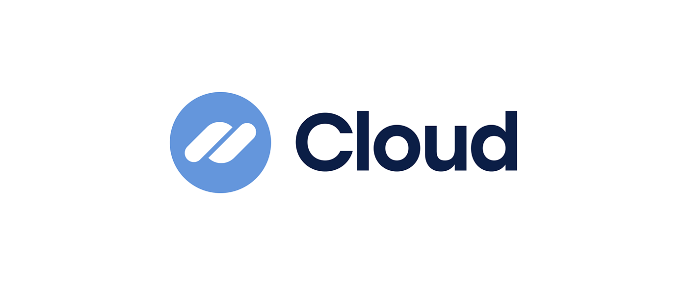
The logos of all ecosystem products and services are built on the parent brand identity.
The symbol and the word Cloud are added to the name of the product in the company's brand blue color. Modern neo-grotesque RF Dewi font brings a sense of confidence to the visuals.
We made the symbols more graphic, lowered the ascender of the letters, L and D, and adjusted kerning.
The logos of all ecosystem products and services are built on the parent brand identity.
The symbol and the word Cloud are added to the name of the product in the company's brand blue color. Modern neo-grotesque RF Dewi font brings a sense of confidence to the visuals.

Color Scheme
The core color scheme is white with different hues of blue. We kept the logo light blue to celebrate the brand’s history. The darker blue hue that we chose makes the whole combination pop.
We also added a monochrome version that is easily combined with other colors and adapted to any task.
We also added a monochrome version that is easily combined with other colors and adapted to any task.


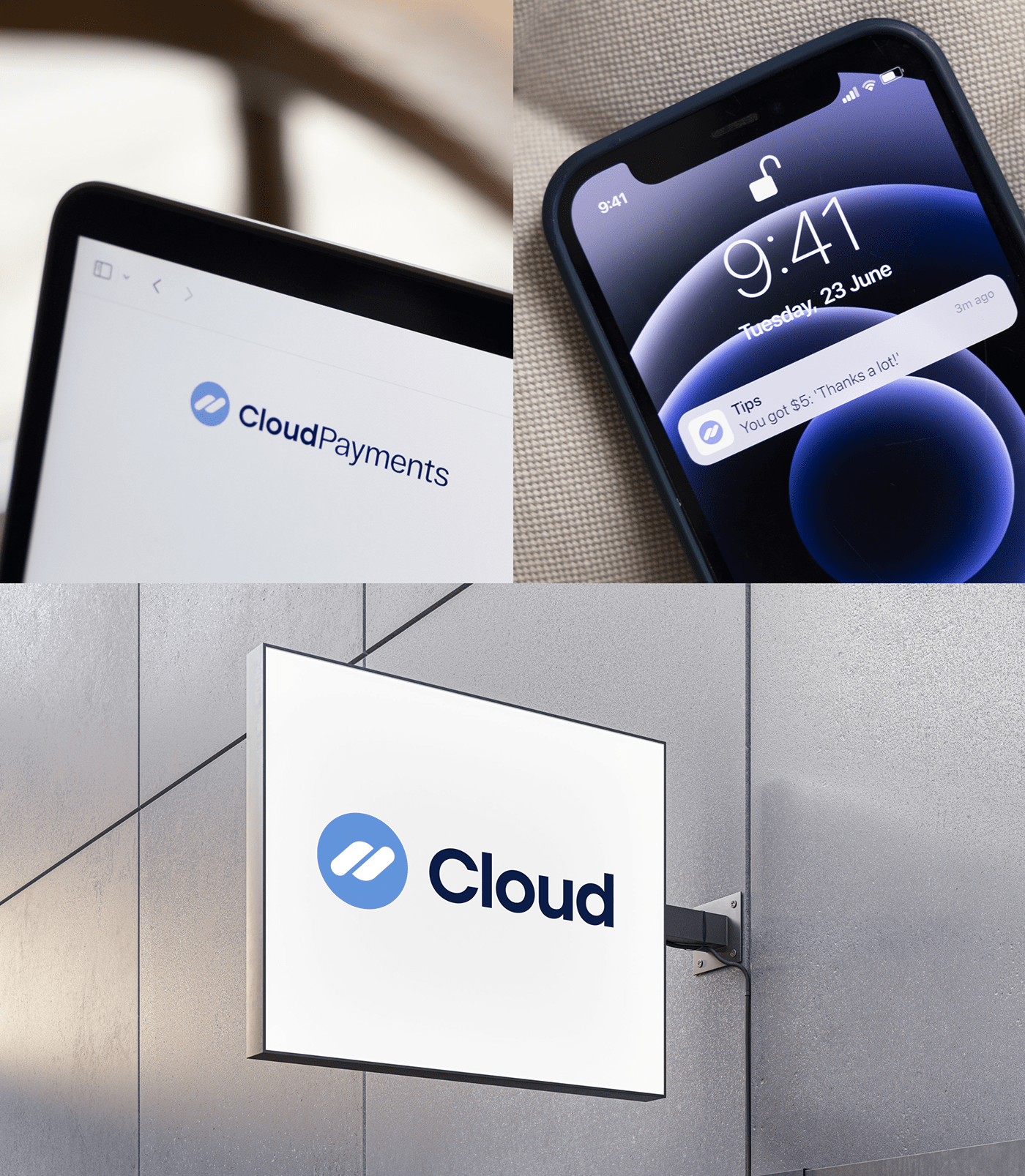
We successfully refreshed the brand's identity. The design now reflects the structure of the corporate group and emphasizes the interconnection of all the products. Although it takes customers and partners time to get used to the new image, it eventually unlocks endless opportunities for brand development.
CloudPayments helped us search for references and were actively involved in the process.
During the project, we worked closely with the client's team. Together, we held workshops and creative brainstorm sessions, analyzed layouts, discussed controversial points, and found alternative solutions.
CloudPayments helped us search for references and were actively involved in the process.
During the project, we worked closely with the client's team. Together, we held workshops and creative brainstorm sessions, analyzed layouts, discussed controversial points, and found alternative solutions.


